“Forty-two!” yelled Loonquawl. “Is that all you’ve got to show for seven and a half million years’ work?”
-Douglas Adams, The Hitchhiker’s Guide to the Galaxy
“I checked it very thoroughly,” said the computer, “and that quite definitely is the answer. I think the problem, to be quite honest with you, is that you’ve never actually known what the question is.
I: The Questions
The datasets in the Arctic Data Center don’t quite cover all of Life, the Universe, and Everything, but we’ve figured out some good questions we can ask of the network we do have. In the second part of this blog I’m going to tell you all about the new network we’ve been building, but for now I’ll focus on the network we’ve been talking about in the past several blogs. As you may or may not remember, the network art I’ve been posting visualizes the relationships among datasets in the Arctic Data Center repository, where the nodes are people who have contributed datasets, and the links are datasets, connecting people who worked together on the same dataset.
In my last blog, I wrote about different ways we can measure network characteristics at the node level and at the network level. I mentioned statistics with such esoteric names as “degree,” “betweenness centrality,” “modularity,” and “density.” Each of these is a function of the data–they are mathematical measures of particular network characteristics. And each is precisely defined using the language of math. Mathematical precision is useful when we want to compare characteristics of two different networks: we calculate the value of the function for both networks then compare the results. But what do these measures mean in human terms? What do they tell us about the world of the Arctic Data Center?
As the poor sods in The Hitchhiker’s Guide to the Galaxy discovered (and as many a graduate student has since rediscovered), you should always start with a question. We’ve been thinking hard about what the good questions are to ask of our contributors network, and here’s the list we’ve come up with so far:
- Who are the contributors with the most connections to other contributors?
- Who are the contributors most important to maintaining the connectivity of the network?
- What do the communities of collaborators look like? How may communities are there? Is the network “clique-y” or more evenly connected? How connected are communities with each other?
- How many datasets are from only one contributor?
- Do characteristics of the network match up with real-world categories, like sub-discipline, study location, or the type of institution the contributor belongs to?
- How do the network’s size, topology, and other characteristics change over time?
We’ve identified network statistics that will answer most of these questions. Where we’re stumped, for the moment, is at Question #5. As Gödel taught us, no consistent system can demonstrate its own consistency. For us this means that any comparison of network characteristics with features of the natural world requires information from outside the network. We need metadata on how contributors identify with scientific disciplines and on what types of institutions contributors work from. Many datasets have keywords attached, and while we’re getting better at keywords they still tend to be a bit of a mess, and the battle for good metadata is far from won.
We think that the answers to Question #5 could provide lots of interesting insights. For example, we can ask how we might define scientific disciplines not through shared concepts, theories, and ideas, but rather through shared work on particular types of data: data that were collected about the same things, in the same way, at the same location, or at the same time. Comparing “disciplines” as defined by interactions through datasets to more traditionally-defined scientific disciplines could suggest possible collaborations that might not have otherwise presented themselves. Opportunities for researchers to think about their work in new ways.
So part of this project will be to identify knowledge gaps: things in the metadata we wish we knew but don’t now know. Guideposts for the road ahead.
II: The Flip-Flop
In gymnastics: Hurtling yourself backwards, headfirst, at high velocity, into a space you cannot see so that you land inverted, a split-second of hands down feet up, then a launching off your hands so that after another brief airborne moment you touch down gently, with grace and style, on your tippy-toes, in perfect balance.
In network science: flipping a network so that the nodes are edges and the edges are nodes. Much less likely to cause irreparable damage to my body or my ego.
We like the network we built of people connected by datasets. But DataONE generally and the Arctic Data Center specifically deal in datasets, and the point of building these networks is to find relationships among the datasets that can help people with their research. So this week, the big job was to flip our fist network, changing it from people as nodes and datasets as links, to datasets as nodes and people as links. When I first proposed this, I was asked, “Do you think the networks will be pretty similar, or pretty different?” And I didn’t know because I’d never done it before. Now I’ve done it, and now I know…
And so I present yet another network visualization. This network was built from exactly the same database query as the previous one, except now the nodes represent datasets, and a link between two nodes is a person who worked on both datasets. The idea is that all of the datasets that a particular person contributes to probably have something in common, either in their content or their disciplinary focus or in some other characteristic which made that particular researcher interested in collecting those particular data. By looking at connections between datasets as mediated by researchers, we can find groups of datasets that are related to each other. Here’s what that network looks like:
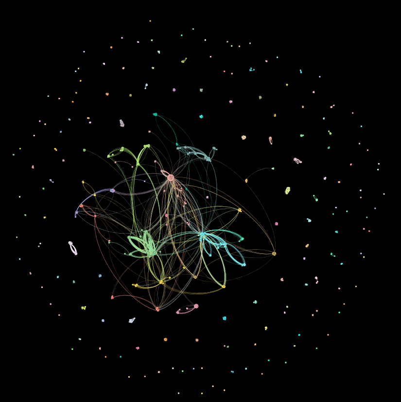
This network looks an awful lot like the one from which it was flip-flopped. Around the periphery we see a lot of isolated components: nodes that are connected among themselves but not with the larger network. This network also has one giant component in the middle, much like its previous incarnation. The detailed structures of this network are harder to see in this visualization, though, and that’s because it’s much larger. The previous version was made up of 2,370 nodes and 7,530 links. This network has 3,792 nodes and a whopping 170,719 links. We’re going to dig deeper into the detailed structures of this network next week (more pretty pictures!), as well as talk about the really, really important thing we can get out of this one that we can’t get out of the first one. So stay tuned…
…Next week: How our new network can potentially add a new and different kind of usefulness to the Arctic Data Center repository.