

Now isn’t that a pretty thing?
Well yes, but what does it mean?
I’m so glad you asked….
Pictured above is a visualization of the network of DataONE datasets in the Arctic Data Center repository. The nodes (circles) are people, and the links (lines connecting the circles) are datasets. So what you’re looking at is the way in which people are connected through the datasets they contribute to. Stare at it for a while. What do you see?
Before I tell you what I see, a couple of notes about how the network was assembled. Bryce Mecum, arctic researcher and mentor extraordinaire, queried his database and created a list of all the datasets in the ADC repository, along with a list of contributors to each of those datasets. Of the 4,401 datasets in the repository, 2,472 were created by just one person. So the first thing to do was toss those singletons out. Networks are about connections, and a bunch of solitary nodes doesn’t make for a very interesting network. Of the 1,929 remaining datasets with at least two contributors, the minimum number of contributors was two and the max was 45 (forty-five people working on a single dataset!), with a median of 3 contributors and a mean of 3.51. Here’s a histogram of the number of contributors per dataset:
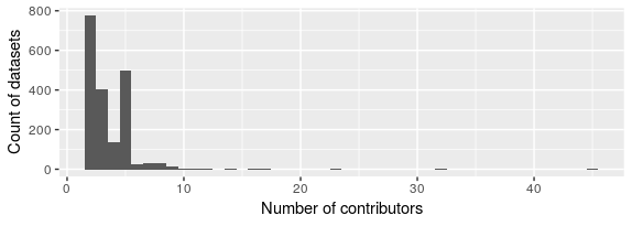
Classic power-law distribution. We see these a lot in social network analysis. If we get ambitious with this project, we could fit a statistical model to this distribution. Might tell us something interesting…
But back to the network itself. The colors you see in the network diagram represent what are called modules, or sub-graphs. We run a fancy-schmancy community detection algorithm that looks for groups of nodes that are more connected among themselves than they are connected to the rest of the network. Those groups are communities, or modules, or sub-graphs. You can see that for a lot of the groups around the periphery of the network, it’s easy to identify modules because they’re connected among themselves only, and not to the rest of the network. For that big mess in the middle, though, modularity is a little more complicated. Helpfully, the visualization software I’m using (a program called Gephi) allows us to color each of the modules differently so they stand out a little better. Pretty, right? Pretty and useful.
So what exactly is this network telling us? A lot, as it turns out. First, you can see the isolated groups around the edges of the network are made up of smaller numbers of nodes: groups of 2 or 3 or 5 or 10. These are contributors who worked with a few collaborators to produce a single dataset, then moved on to different things. We thank them for their contribution and wish them well, and will welcome them back into the DataONE family if they decide to connect up with us again. Why the thicker lines in some of the groups? Remember, the links are the datasets, and thicker lines means more datasets. So those are the groups who have contributed more than one dataset to the repository.
What about some of those more interesting structures in the middle? The big pink blob in the lower left, for example? That’s a group of people who collaborate together often, on multiple datasets. It’s a big group (I’m guessing Bryce probably knows who they are, but he isn’t telling.) Big, but isolated. They work together a lot, but don’t work very often with others outside the group.
The yellow group in the upper right, and the groups it’s connected to in teal and brown and brick red and forest green… Very interesting stuff going on there. These are groups of people who work together often, and are connected by a couple of key collaborators in each group. Do you see the three teal nodes in the group of yellow? The two yellow nodes in the group colored brick red, and the single yellow node in the group of teal toward the bottom left? Those nodes are what network nerds call “hubs.” They connect groups with each other, and are very important to the overall connectivity of the network. They might be people whose work crosses disciplines, or people who have connections in several labs. But without them, the network starts splitting apart.
Identifying those people is one of the many things we can do with a network like this. But more broadly, where do we go from here? We have a visualization that contains a lot of information. What are the interesting questions? Beyond the “gee whiz, pretty picture” response, why do we care? Stay tuned.
… Next week: How network analysis can add value to the DataONE project.