
Part I: The Art
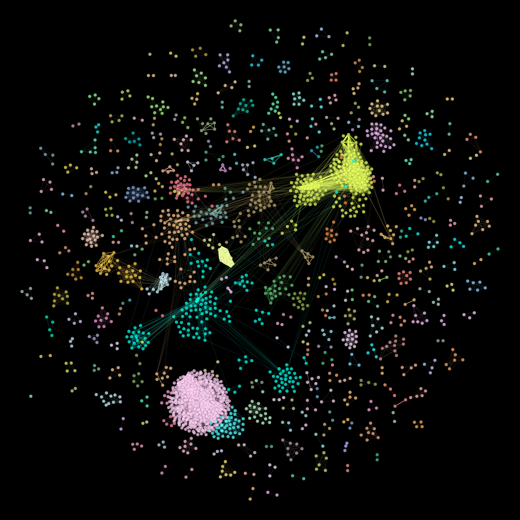
Someday I’m going to have a gallery showing of network art. Remember this one from last week?
Let’s look at two giant components of this network in more detail. (And yes, they really are called “giant components,” even among network nerds.) The image below is the first giant component visualized in isolation. It’s that big structure in the middle of network; the “community” in the network with the most connected nodes.
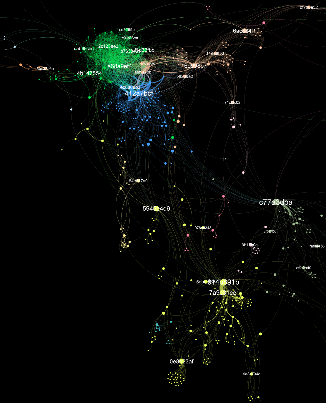
The colors are different from the whole-network visualization in the first image. The green bits in the upper left of this image correspond to the yellow bits in the first visualization. And I’ve flipped the image around and cropped it to make the central structure more clear. But color and cropping aside, I think it looks like a jellyfish.
The labels indicate nodes with a high score for betweenness centrality. More on that in Part II: The Science, below. But for now, nodes with a high betweenness centrality are important to connectivity across the network. We can see this, for example, at the “c77a3dba” node in the center right. That node is crucial to maintaining the connectivity between the upper part of the network and the lower part (some of which has been cropped out of the image above.) Another example: in the lower center, the node “0e8b23af” connects all the nodes in the star pattern below it to the main part of the network.
We’ve anonymized the node labels in order to protect people’s privacy, but each of these nodes is an actual, real-live person. Whoever you are, c77a3dba, you’re a crucial member of the Arctic Data Center’s datasets network.
The other interesting giant component from the whole-network visualization is the giant pink blob in the lower left. Here’s what it looks like all by itself:
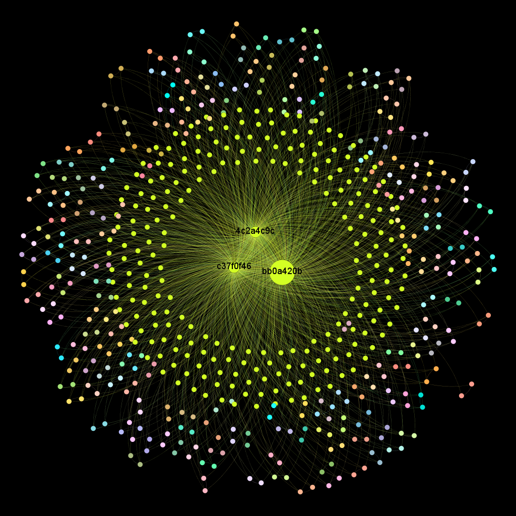
The flower-structure of this sub-network is interesting, and we’re investigating whether or not that structure is an artifact of the way data is stored and cataloged at the Arctic Data Center. But clearly the three nodes in the center are extremely important to the overall connectivity of this sub-graph.
We promised you more than just pretty pictures this week, so, on to…
Part II: The Science
Network visualizations make visible the otherwise invisible connections among researchers. Quantitative analysis of these networks helps us understand the underlying complexity of those interactions. Network measures fall into two broad categories: node-level measures and network-level measures. For node-level measures we’ve already run into betweenness centrality above; degree and modularity class are two other statistics we can measure at the node level. Network-level measures include overall modularity, network density, and the number of connected components.
- Degree: Also known as degree centrality, this is the easiest thing to measure on a network. It’s simply the number of links connected to a particular node. If the node has five links, its degree is 5. The higher the degree, the more connected the node. We can also measure the average degree for the network as a whole. The ADC network has an average degree of 6.354, which means that the average number of links per node is a little more than six.
- Betweenness centrality: This one is a little trickier. Imagine taking any two nodes in the network, and plotting a path between them. There may be more than one path, so plot just the shortest path–the path that goes through the fewest nodes. Take the giant list of all the shortest paths between every pair of nodes on the network, and look for nodes that are on a lot of those shortest paths. Do some math, and you get a measure of betweenness centrality. This measures how important the node is to the overall connectivity of the network. The labeled nodes in the network visualizations above are nodes with high betweenness centrality.
- Modularity: This comes from the spiffy community detection algorithm I mentioned last week. There are approximately ten thousand community detection algorithms out there, and I won’t go into the mathematical details here, but basically what a community detection algorithm does is look for groups of nodes that are more connected among themselves than they are connected to the graph as a whole. Once it figures out how many communities are in the network, the community detection algorithm assigns a modularity class to each node based on which community the node belongs to. We can also calculate the overall modularity (clique-y-ness) of the network (a number between 0 and 1.) The overall modularity of the ADC network is 0.843, which is high, and suggests sophisticated internal structure. We didn’t need a number to tell us that, but quantifying the overall modularity can help if, for example, we want to compare two different networks.
- Network density: This statistic is a measure of how close the network is to complete. A complete network is one with all possible edges. The ADC network is pretty fractured overall, so we would expect its density score to be pretty low. In fact, it’s 0.003, or 0.3% complete.
- Connected components: Maybe this one should be called “unconnected components,” because it measures the number of isolated components in the network. The ADC network has 284 components, made up of nodes that are connected among themselves only, and not to the rest of the network.
By now, you should have some sense of the types of questions these network statistics can answer, but we’re going to dive more deeply into that topic next week. Stay tuned…
….Next week: Everything the math is telling us about our little sphere of the world.