
Hoi!
This week I’m happy to share with you some visualizations that reflect components of the DataONE publications and the articles that cite those publications. I created the visualizations with Gephi as I have not found a bibliometrics tool that allows you combine the cited and the citing articles in one visual. I am so thankful to have had Audrey (network analysis whiz and DataONE intern working on visualizing data in the Arctic Data Center repository) help me along the way.
Network Stats
- Number of unique citing articles: 3,218
- Number of cited articles: 113
- Number of links: 4,199
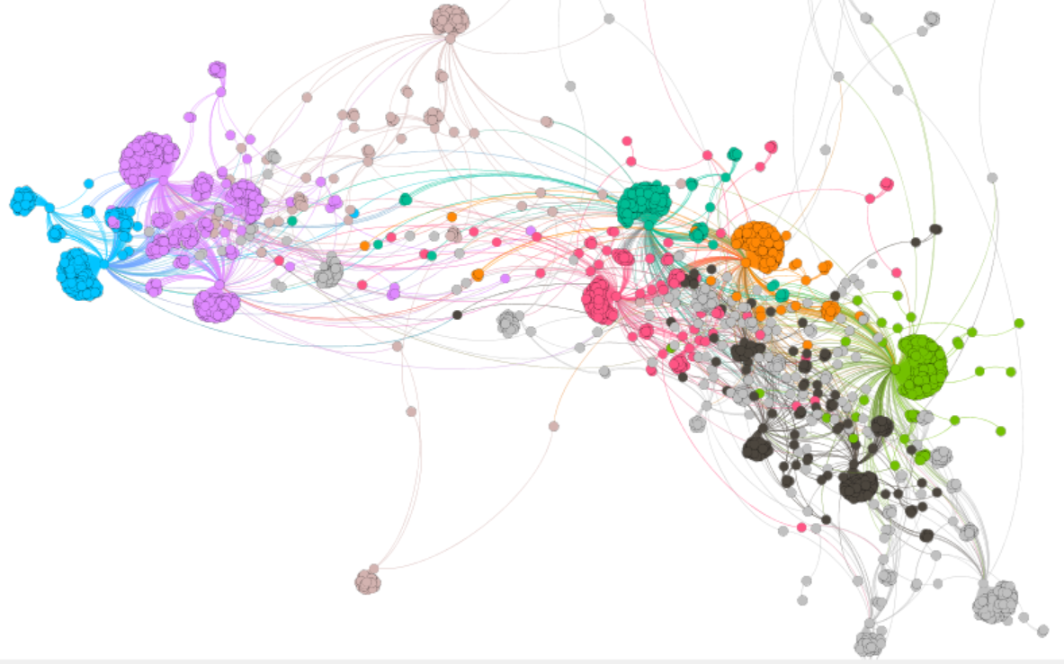
Modularity
I ran modularity on the entire network in Gephi. This allows you to see various communities using the modularity algorithm presented by Vincent D Blondel, Jean-Loup Guillaume, Renaud Lambiotte, Etienne Lefebvre (2008). In the visualization below, there are approximately 8 main communities and an overall modularity of 0.752. Once I ran the modularity statistic I looked at the articles’ titles in the network to see if they showed any topical cohesiveness and they did! Using this method I labeled 8 main preliminary topic communities: ecology + citizen science, data sharing, data management, data networks/visualization, citizen science, problems and solutions, data gathering best practices, and big data/data processing. Unfortunately, I couldn’t get the modularity to run in any informative way on just the citing articles so this analysis is based on both cited and citing articles. I’m going to explore more and see if I can get this to work.
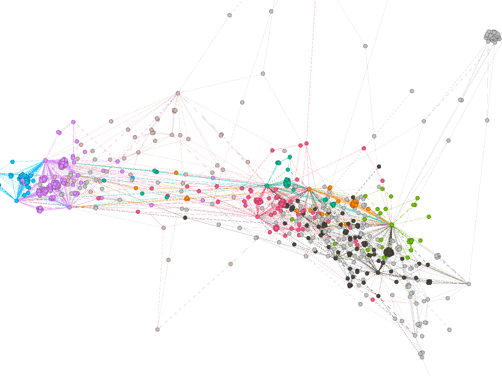
A degree of 2– The visualization below represents articles that have citing articles that have connections to at least two DataONE articles. As you can see, the network is significantly reduced.
Citing articles color coded by year– Dates covered are 2019 (9.52% pink), 2018 (19.94%, pink), 2017 (18.29% green), 2016 (17.52%, blue), 2015 (13.36%, dark grey), 2014 (10.14%, orange), 2013 (6.23%, teal), 2012 (3.6%, dusty pink), 2011-2009 (remaining 1.4%, grey). The cited articles in this visual are black and are not color coded by year. I apologize this visual is cut off. The screenshot tool in Gephi is a bit buggy.
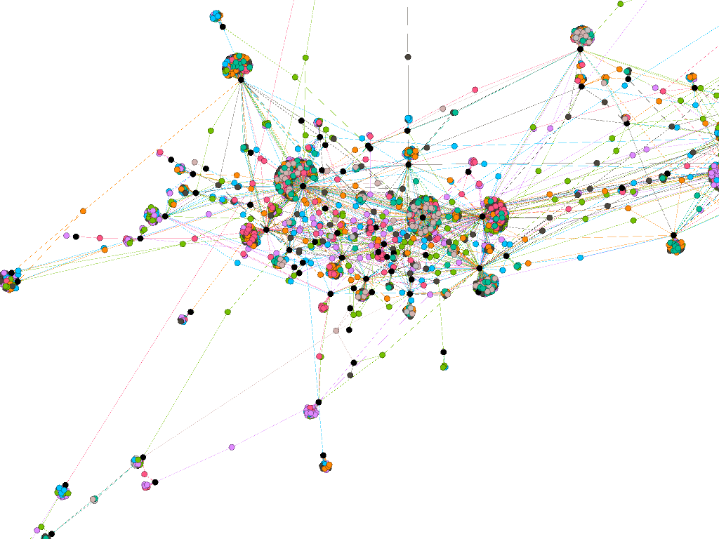
Citing articles sized and colored by number of different DataONE articles they cited– The biggest nodes in this network represent articles that cited 7 different DataONE articles and the smallest have cited one.
In the last visual you can see some nodes that surround the periphery of the network. I am going to dig into this more and figure out what these outliers are all about. Also, in next week’s blog expect some summary reports, network insights, and results from my data mining of DataONE mentions on the web!