
Hello Folks,
I hope you all had a great Fourth of July week. After some misadventures with my family and a visit to the ER, we are all back in business and running at full speed.
I promised some visuals and WordPress is finally going to let me deliver.
Below I have pasted in an early version of the layout for our outreach two-pager. After getting the language out for comments last week, this week was spent learning more about using InDesign for designing print materials, finding data for metrics that will match audience needs and interests, and working out a quality layout design. Let me know if you have any high level feedback. We are still early days, but the internship is moving by quickly.
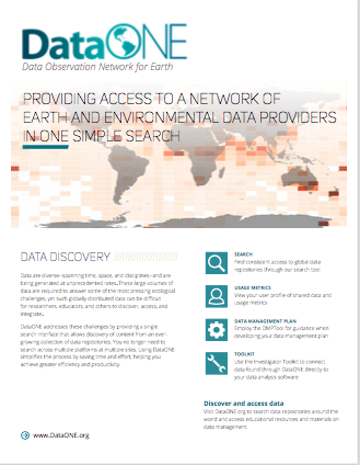
Trying to make the two-pager larger to get a closer look? You can’t, sorry. With the text still going through edits, I’m just using an old draft as a placeholder.
And really, you shouldn’t even look at the data in my heat-map. Rplot is giving me a hard time and doesn’t want to print the correct cell values, but in general it gives you an idea of what we are going for. Anyone want to lend me their ggplot skills? I could use some help.
Over the coming week I’m going to be finishing up four-versions of these outreach materials, one for each audience. Which means, we need to develop a separate suite of metrics to match each audience’s specific interests and needs.
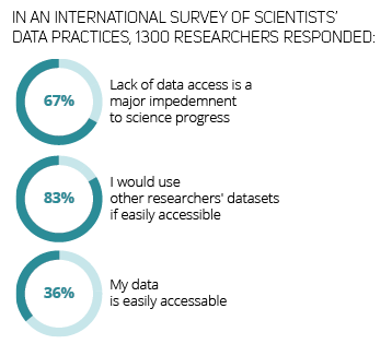
And before I leave you, here’s one other figure I worked through yesterday. I used data from Tenopir et al. (2011; See it here) to demonstrate the importance of sharing data, the interest in sharing data, but the limited practice of making your data available.
Have a great weekend.
Megan
Reference:
Tenopir C, Allard S, Douglass K, Aydinoglu AU, Wu L, Read E, et al. (2011) Data Sharing by Scientists: Practices and Perceptions. PLoS ONE 6(6): e21101. https://doi.org/10.1371/journal.pone.0021101